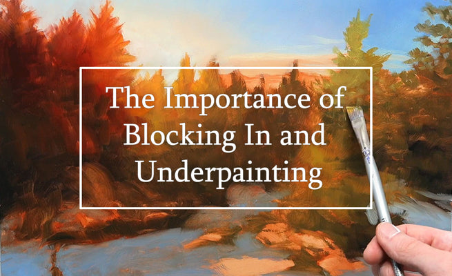
The color of our workspace can play a big role in the outcome of our art. As an artist, I consider my studio to be my sanctuary, a space where I can let my creativity run wild and explore my passion. For the longest time, I had always painted in a studio with plain white walls. I chose that color for the same reason I imagine many do, it's clean and professional looking. Over time however, I realized that my white walls were actually hindering my artistic process.

Note: This blog contains affiliate links and purchasing through them supports our site at no extra cost to you.
Now before I go any further, understand that this is what my experience has been. I think that there are different reasons for why different artists might want to have certain color schemes in their studio. Hopefully though, this can help give you some things to consider for what might be best for you and your artwork.
So anyways, I came across an article one day that talked about how green-gray walls have been a popular choice for artists for ages. The article explained that the muted, neutral tone of gray provided a perfect backdrop for artwork, allowing the colors in the painting to stand out more vividly and pop.

Curious about this idea, I started researching the history of using green-gray colors in art studios and discovered that the use of a gray-green shade called "French Gray" dates back to the 18th century. It was a favorite of the French Impressionists, who used it in their studios to create a harmonious atmosphere that would not distract from their artwork.

I was fascinated by the idea of a darker color such as this and decided that since I was already renovating my studio, that I would try it out for myself. I painted my studio walls in a soft shade of gray-green (called Black Bamboo), similar to the French Gray. And I have to say, the results were undeniable.
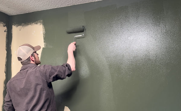
Not only did the gray-green walls create a calming and inspiring atmosphere, but they also made my paintings appear better to me. The muted tone of the walls allowed the colors in my oil paintings to shine and pop in a way that they never did against the stark white walls I had before.

However, I must stress that there is no "magic color" that will unlock everything for your art. Gray-green walls might not be the best choice for everyone, and it's important to think hard about the impact that color can have on your creative process. It's essential to experiment and find what works best for you. Exploring the use of color in your art studio is a step towards enhancing your artistic journey.

I wanted to share my experience with you and what I found to work best for myself as a landscape and wildlife artist. In the end, what I would suggest is to try out a couple different color schemes. You could hang a piece of white fabric behind your easel to see how you feel about a bright tone. Conversely, you could try that with a black fabric as well to test out some tones before committing to a paint color.

I hope this has helped give you a few new things to think about when approaching the color of your studio. Color has such a big impact on the way we perceive our paintings and so I encourage you to challenge yourself on this topic.